What Are CSS Media Queries?
CSS media queries are conditional rules that apply styles only when certain conditions are met — most commonly, when the viewport is a specific width. They are the technical foundation of responsive web design, allowing a single stylesheet to produce different layouts at different screen sizes.
@media (min-width: 768px) {
  .container {
    display: grid;
    grid-template-columns: 1fr 2fr;
  }
}
The query above says: "When the viewport is at least 768px wide, apply these styles." Below 768px — on phones — the default styles apply instead. This is the mobile-first pattern in its simplest form.
Mobile-First vs Desktop-First: The Critical Choice
There are two ways to write media queries, and they lead to very different code quality outcomes:
Mobile-First (Recommended)
Write base styles for mobile screens, then use min-width queries to progressively add complexity for larger screens:
/* Base: mobile styles (no query) */
.nav { flex-direction: column; }

/* Tablet and up */
@media (min-width: 768px) {
  .nav { flex-direction: row; }
}

/* Desktop and up */
@media (min-width: 1024px) {
  .nav { gap: 32px; padding: 0 48px; }
}
Desktop-First (Avoid for new projects)
Write base styles for desktop, then override with max-width queries for smaller screens:
/* Base: desktop styles */
.nav { flex-direction: row; gap: 32px; }

/* Override for tablet */
@media (max-width: 1023px) {
  .nav { gap: 16px; }
}

/* Override for mobile */
@media (max-width: 767px) {
  .nav { flex-direction: column; }
}
Why desktop-first creates problems: On slow mobile connections, the browser downloads and parses all the desktop styles before applying mobile overrides. Mobile-first ensures the smallest style payload reaches mobile devices. It also keeps specificity cleaner and forces you to think about mobile experience as the default, not an afterthought.
The Modern Breakpoint System
There are no universally correct breakpoints — they should ideally be derived from your content's natural breaking points, not arbitrary device sizes. However, these commonly-used breakpoints cover the widest range of real devices:
| Name | Min-Width | Target Devices |
|---|---|---|
| XS | 320px | iPhone SE, small Android phones |
| SM | 480px | Larger Android phones, landscape phones |
| MD | 768px | Tablets (portrait), large phones (landscape) |
| LG | 1024px | Tablets (landscape), small laptops |
| XL | 1280px | Laptops, small desktops |
| 2XL | 1536px | Wide desktops, external monitors |
Content-based breakpoints: The best approach is to add a breakpoint wherever your specific content starts looking wrong, not at predetermined widths. Resize your browser slowly from 320px to 1600px and add media queries only where the layout actually breaks.
Modern Media Query Features
Range Syntax (CSS Media Queries Level 4)
The new range syntax is cleaner and more readable than the classic min/max approach:
/* Classic */
@media (min-width: 768px) and (max-width: 1023px) { }

/* Modern range syntax */
@media (768px <= width < 1024px) { }
Orientation Queries
@media (orientation: landscape) {
  /* Styles for landscape orientation */
  .hero { min-height: 60vh; } /* shorter on landscape phones */
}
Prefers-Reduced-Motion
@media (prefers-reduced-motion: reduce) {
  *, *::before, *::after {
    animation-duration: 0.01ms !important;
    transition-duration: 0.01ms !important;
  }
}
Container Queries
Container queries are a modern CSS feature now supported in all major browsers. Instead of responding to viewport size, styles respond to the size of a parent container — enabling truly component-level responsiveness:
.card-container {
  container-type: inline-size;
}

@container (min-width: 400px) {
  .card {
    flex-direction: row;
    padding: 24px;
  }
}
Common Media Query Mistakes
- Missing the viewport meta tag — Without
<meta name="viewport" content="width=device-width, initial-scale=1">, all your media queries are ignored on mobile browsers. - Using px for font-size in media queries — If a user has set a larger base font in their OS,
em-based media queries respect that preference, whilepxdoes not. - Too many breakpoints — More than 5 breakpoints indicates a layout problem. Simplify the design rather than adding more queries.
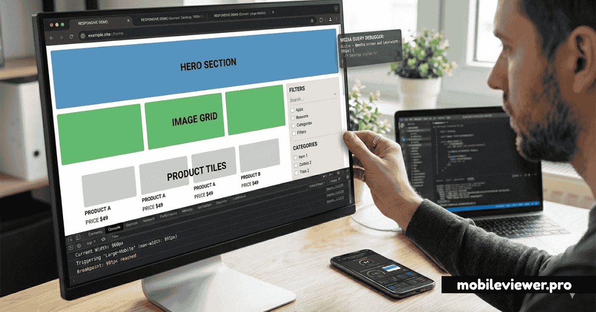
- Not testing between breakpoints — Layouts often break at sizes between your defined breakpoints. Use MobileViewer.pro with custom size inputs to test every viewport width, not just breakpoint values.
- Overriding instead of composing — Writing mobile-first means each query adds to previous styles. If you're constantly writing
display: noneto hide mobile elements on desktop, your base styles are wrong.