Defining the Two Approaches
Responsive and adaptive design are both strategies for making websites work across different screen sizes — but they achieve this through fundamentally different mechanisms. Confusing them leads to architecture decisions that create months of technical debt.
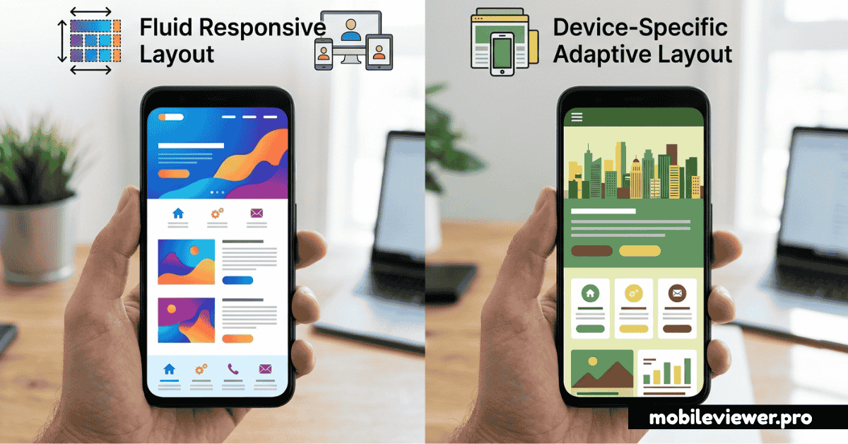
What Is Responsive Design?
Responsive design uses fluid grids, flexible images, and CSS media queries to create a single layout that continuously reflows and resizes to fit any screen width. The layout is like water — it fills whatever container it's placed in. One HTML file, one CSS file, infinite screen widths handled gracefully.
What Is Adaptive Design?
Adaptive design detects the user's device and serves a specific, predefined layout designed for that device class. Instead of one fluid layout, you build multiple distinct layouts (desktop, tablet, mobile) and the server or client logic selects the right one. The classic example is "m.website.com" — a completely separate mobile site.
Head-to-Head Comparison
| Factor | Responsive | Adaptive |
|---|---|---|
| Maintenance | One codebase to maintain | Multiple templates/codebases |
| Performance | Same assets for all devices | Can serve optimized assets per device |
| Flexibility | Works at any screen size | Works best at predefined breakpoints |
| Development Cost | Lower initial investment | Higher — multiple layouts to build |
| SEO | Preferred by Google (single URL) | Can cause duplicate content issues |
| User Experience | Consistent but may compromise at edges | Tailored experience per device class |
| Best For | Most websites and web apps | Complex products with distinct UX needs per platform |
The Case for Responsive Design
Responsive design has become the default recommendation for good reasons. Google explicitly recommends it as the preferred mobile configuration because it keeps all content on a single URL, making it easier to crawl, index, and share. A single canonical URL also means backlinks point to one place, consolidating your SEO authority.
The development workflow is simpler: one codebase, one set of templates, one deployment pipeline. When you update content, it's updated everywhere. Bug fixes apply universally. This efficiency compounds over years of product development.
Modern CSS makes responsive design more powerful than ever. CSS Grid and Flexbox handle complex multi-column layouts that would have been impossible with floats. Container queries (now widely supported) let components respond to their own container size rather than the viewport — enabling true component-level responsiveness.
When to choose responsive: For marketing sites, blogs, ecommerce, SaaS apps, portfolios, and any site where content is the same across devices. That covers 90%+ of websites.
When Adaptive Design Makes Sense
Adaptive design has a legitimate role when the user experience truly differs between device classes — not just the layout, but the actual functionality and content. A newspaper might show a full editorial experience on desktop and a streamlined reading app on mobile, with genuinely different navigation, interactions, and content hierarchies.
Performance is the other argument for adaptive. If you're serving a heavy, data-rich dashboard to desktop users, you don't want to download that JavaScript bundle on a mobile device where users need a simpler interface. Adaptive lets you send literally different code to different devices.
The hidden cost is operational: maintaining two (or more) codebases means bugs can exist in one but not the other, A/B tests become complex, and new features must be built multiple times. Large organizations like Amazon, Airbnb, and Facebook have the engineering capacity to manage this — most teams don't.
The Hybrid Approach
Many real-world products blend both strategies. You might have a single responsive codebase but conditionally load different JavaScript modules based on the device type detected server-side. Or you might serve different image sizes and resolutions per device (adaptive delivery) within an otherwise fully responsive layout.
The <picture> element and srcset attribute are good examples: they let the browser choose the most appropriate image based on viewport size and pixel density — adaptive image delivery inside a responsive layout.
The Recommendation
For the vast majority of projects: start with responsive design. The SEO benefits, maintenance simplicity, and the maturity of the CSS tooling make it the correct default. Build mobile-first — write styles for the smallest screen first, then add complexity for larger screens. This approach forces discipline and usually produces better mobile performance.
Consider adaptive design — or a hybrid — only when you've clearly identified that the mobile and desktop experiences need to be architecturally different, not just visually rearranged. And even then, question whether a Progressive Web App (PWA) with responsive design might achieve the same UX goals without the overhead of maintaining parallel codebases.
Test your responsive implementation: Use MobileViewer.pro to preview your responsive site across dozens of device sizes instantly. It's the fastest way to catch layout edge cases between your CSS breakpoints.